
Falcon Builder Overview
Falcon Builder is the visual drag-and-drop page builder built into Falcon CMS. Build complex page layouts directly inside the admin dashboard — no code, no templates, no page refreshes.
It works for Pages, Posts, Custom Post Types, the Header, and the Footer.
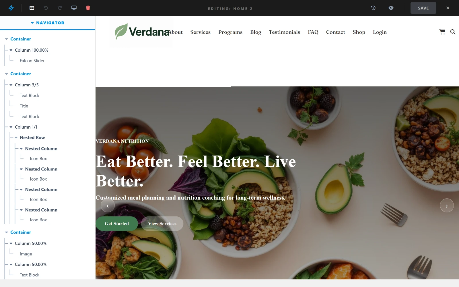
The navigator on the left is the page structure; the canvas on the right renders the real theme.
How to Open the Builder
For Pages & Posts
- Go to Admin → Pages (or Posts / any CPT)
- Open or create a content item
- Click Open Builder in the editor toolbar
- The builder canvas opens in full-screen mode
For Header & Footer Pro
Header and footer layouts are built in the Layout Builder, which needs a Pro licence to create, edit or assign.
- Go to Admin → Falcon Builder → Layout
- Name a layout and click Create New Layout — or use the Global Layout, which is already there
- Click a slot (Select Header, Select Footer, …) to assign an existing section or create a new one
- The same builder opens, scoped to that section
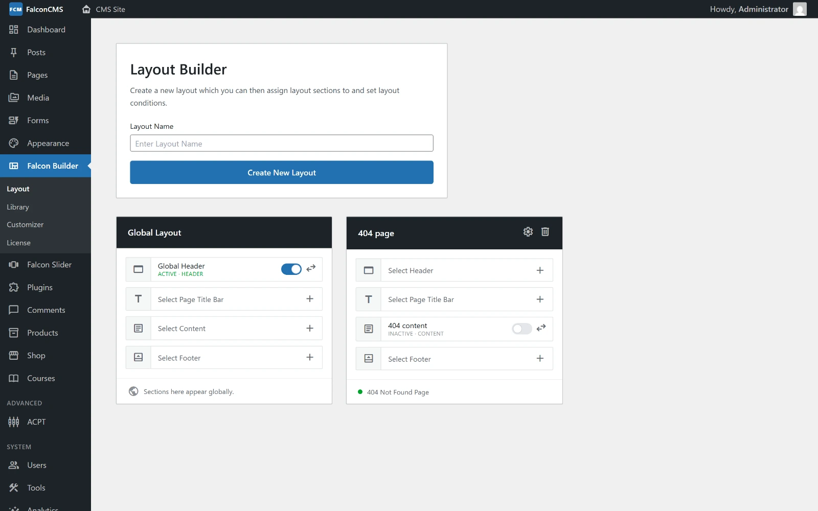
Each layout is four slots — Header, Page Title Bar, Content, Footer — and each slot can be switched off without unassigning what is in it.
A layout is a set of four section slots:
| Slot | Backed by |
|---|---|
| Header | a falcon_header section |
| Page Title Bar | a falcon_ptb section |
| Content | a falcon_content section |
| Footer | a falcon_footer section |
The Global Layout applies everywhere. Any other layout carries its own conditions — set them with the gear icon on the layout card — so a site can run a different header on, say, its 404 page than everywhere else. The toggle beside a filled slot turns that section off without unassigning it, which is the quickest way to compare two headers.
Builder Interface
┌─────────────────────────────────────────────────────────┐
│  [← Back]  Page Title       [Desktop][Tablet][Mobile]  │  ← Top bar
│            [Save Draft]  [Publish]                      │
├──────────────┬──────────────────────────────────────────┤
│              │                                          │
│   Sidebar    │           Canvas                         │
│  (Settings)  │   ┌────────────────────────────────┐    │
│              │   │  Container                     │    │
│              │   │  ┌──────────┐  ┌──────────┐   │    │
│              │   │  │ Column 1 │  │ Column 2 │   │    │
│              │   │  │ [Element]│  │ [Element]│   │    │
│              │   │  └──────────┘  └──────────┘   │    │
│              │   └────────────────────────────────┘    │
│              │   [+ Add Container]                      │
└──────────────┴──────────────────────────────────────────┘- Canvas — the live preview of your page. Drag, drop, and click to edit
- Sidebar — appears on the right when you select an element, showing its settings
- Top bar — device preview toggles, save, and publish
Building a Page — Step by Step
Step 1: Add a Container
Click + Add Container at the bottom of the canvas. A modal opens where you choose the column layout:
| Layout | Use case |
|---|---|
1 column | Full-width hero, banner |
1/2 + 1/2 | Two-column content |
1/3 + 2/3 | Sidebar + content |
1/3 + 1/3 + 1/3 | Three-column features |
1/4 × 4 | Four-column cards |
Step 2: Add Elements to Columns
Click the + button inside any column. The element picker opens — choose an element type and it's added instantly.
Step 3: Edit the Element
Click any element on the canvas to select it. Its settings appear in the sidebar on the right. Every change reflects live on the canvas.
Step 4: Reorder
- Drag elements up/down within a column, or move them between columns
- Drag containers using the handle on the container toolbar to reorder rows
Step 5: Save & Publish
- Autosave runs every 30 seconds in the background
- Save Draft — saves without making changes live
- Publish / Update — makes the page live immediately
Container & Column Toolbar
Hover over any container or column to reveal its toolbar:
| Button | Action |
|---|---|
| ⠿ (drag handle) | Drag to reorder |
| ✏️ | Open settings (background, padding, etc.) |
| ⧉ | Duplicate |
| 📚 | Save to Library |
| 🌐 | Save as Global Section |
| 🗑️ | Delete |
All Built-in Elements
The element picker offers 27 elements on any page, plus 3 more that only appear where they have something to bind to (see below). Eight are part of the free core; the rest are marked Pro and need a Pro licence — the picker shows those with a lock badge and prompts to upgrade rather than hiding them.
Names below are exactly what the picker calls them, so what you read here is what you look for.
Text & content
| Element | What it does |
|---|---|
| Text Block | Rich text, edited in place with the WYSIWYG editor |
| Title | The current post or page title, filled in from the content |
| Table Pro | Data table written in a compact markup, with buttons and links inside cells |
| Callout Pro | Boxed aside — note, tip, warning, danger and more, optionally collapsible |
| Code Block Pro | Syntax-highlighted code with a copy button and optional typing reveal |
| Ticker Pro | Horizontally scrolling announcement strip |
Media
| Element | What it does |
|---|---|
| Image | One image, static or from a dynamic source (featured image, logo, author avatar) |
| Video | YouTube, Vimeo or self-hosted |
| Gallery Pro | Grid, masonry or slider, with a lightbox |
Layout & structure
| Element | What it does |
|---|---|
| Button | Call to action — solid, outline or ghost |
| Spacer | Vertical space, set per device |
| Section Separator | Shape divider between sections — waves, tilts, curves, or your own SVG |
| Icon Box Pro | Icon with a title and description, icon above or beside |
| Content Box Pro | Repeatable content blocks in a row or grid |
| Item List Pro | Styled list with an icon on each row |
| Card Pro | Posts drawn with a Post Card design, as a grid, list, masonry or carousel |
Interactive
| Element | What it does |
|---|---|
| Accordion Pro | Collapsible sections — FAQs and the like |
| Tabs Pro | Tabbed panels |
| Counter Pro | Number that counts up when it scrolls into view |
| Star Rating Pro | Star display, 0–5 |
Navigation
| Element | What it does |
|---|---|
| Social Icons | Links to your profiles, as icon chips |
| Menu Pro | A navigation menu — what the header is usually built from |
| Bread Crumb Pro | Trail back to the home page |
| Table of Contents Pro | Built from the page's own headings, with scroll tracking and an optional sticky mode |
| Previous / Next Pro | Links to the pages either side of this one |
| Advanced Search Pro | Search field with filters |
Advanced
| Element | What it does |
|---|---|
| HTML Block Pro | Raw HTML or an embed |
Previous / Next needs a Table of Contents
It steps through a sequence, and a Table of Contents is what marks a page as part of one. On a page without one it would render nothing, so the picker offers it only where it can work and says why where it cannot.
Only where they have something to bind to
These three appear in the Post Card builder and in Layout Sections, where a current post exists for them to read. They are not offered on an ordinary page, where they would have nothing to show.
| Element | What it does |
|---|---|
| Content | The current post's content body |
| Post Meta | Author, date, categories and tags for the current post |
| Product Meta | Price, SKU and stock — renders when the current post is a product |
Older layouts
A page saved by an earlier version may still contain a heading, text, special_text or post_grid element. Those keep rendering exactly as they did, but they are no longer offered in the picker — Title, Text Block and Card cover what they did.
Custom elements — a plugin or theme can add its own to this same picker through the
falcon_builder_elementsfilter. See the Hooks Reference.
Responsive Preview
Use the device buttons in the top bar to preview your layout:
- Desktop — full width
- Tablet — medium breakpoint
- Mobile — small breakpoint
Each element, column, and container can be independently hidden per device. See Device Visibility.
Saving Layouts for Reuse
Pro features
The Library, Global Sections and the Layout Builder all need a Pro licence. Editing a page or post with the builder stays free.
Library
Save any container or column to the Library — reuse it on other pages as an independent copy.
Global Sections
Save a container as a Global Section — edit once, and it updates everywhere it's used across the site.
See Global Sections and Library for details.